
There are many functions in an HMI related to machine status, process variables, manual controls and alarms. However, too much of a good thing, with numbers and different colors all over the screen, is a common occurrence—the developer and programmer overwhelm the operator instead of providing quick access to the 20% of information that is important.
Some basic things to consider in an HMI are animation, use of colors and display of machine status and variables. Too much information or a poor presentation of it fails to provide an operator the information needed at a glance. A pretty picture isn't the goal; quick discovery and understanding of information is.
In the past, vendors loved to market the animation capability of an HMI which led to its overuse in real applications. While animation is attention-grabbing, its use should be limited for that exact reason. There is nothing wrong with a boring display unless there is a problem needing attention.
The HMI doesn't have to be beautiful or aesthetically appealing, but it doesn't hurt. However, a dozen roses are almost always enough, so no need to give three dozen to get your point across; and sometimes a single rose is all that is needed. Regardless of the number, there always needs to be a vase and water included—the basic requirements.
How much information is too much? At some point, too much information will slow down the operator reaction time or decision making. The goal needs to be presentation of usable information to the operator that is quickly noticed and acted upon.
The creative developer may go overboard with animation showing parts moving, conveyors running, pumps rotating and fluid flowing, yet it shouldn't be used to show normal operation. Animation should highlight problems and catch an operator's attention. While tank levels are good to show, that alone is a poor use of animation. Sure, the color can change when it's in an alarm condition, such as high level, but consider including simple graphics to show acceptable ranges, limits and trend information.
Information overload can occur quickly when a machine diagram, status indicators, process values, alarm banners and the states of motors, valves and actuators are all shown on an HMI. Add to that additional status information conveyed as green, red, yellow, orange and blue of many graphical devices, some flashing, and you may have provided too many roses, unless you really messed up. She may know what you did, but you may have to train the operator to know what all the colors mean. Then there are the actual process values and what is the acceptable range for each; and why is that square box flashing? That's too much info, too many graphics and too many colors.
One of the common items discussed is to tone down the use of colors. Start with a light gray background. It's okay to have a boring screen, with little color, when things are operating properly. The use of green, red, yellow and orange should be limited. A simple mode indicator, illuminated green when in auto mode and running could be the only green illuminated indicator on the screen. The use of red, yellow and orange should be limited to indicating alarms, warnings and attention notifications directly within a graphic (Figure 1).
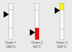
Figure 1: The use of red, yellow and orange should be limited to indicating alarms, warnings and attention notifications directly within a graphic.
I have seen several examples of a position, flow, speed or level process variable drawn as a narrow, horizontal or vertical rectangle. The basic gray rectangle with thin black borders and a few segmenting lines would indicate a zero point, low range, normal operating range, high range and maximum value.
The two short legs of the rectangle are the min and max values, a window in the middle highlighted in blue or a lighter gray boxes in the normal range and a line near each end indicates a low-level and high-level limit. A large block arrow would point to the actual value within the rectangle full scale.
It provides basic process variable indication, all gray scale, until an alarm or warning due to a maximum or minimum value changes a portion of the rectangle to red or yellow. The arrow doesn't need to change; the whole rectangle doesn't need to change. Just the area at the warning area near the high or low limit needs to change to yellow as a warning or, if alarmed, turn red.
Because most of the display is a muted gray, any yellow or red will be easily seen with immediate high or low indication. If color-blind operators view the graphic, the arrow pointing to a scaled point on the rectangle will give the same status. Graphics of actuators can be represented in a similar fashion. Not much more than a rectangle with a block arrow pointing to it is needed to indicate position.
The goal is to quickly show conditions and catch the operator's attention only if there is a problem. Additionally, looking at the graphic should tell the tale with little additional information needed. The graphic shows low level; it doesn't need to show a message unless the operator looks for it in the alarm history. It can show just a symbol such as a square or rectangle. For example, a red triangle pointing up and overlaid on the graphic can indicate a high level. Adding a number to the graphic could indicate a critical alarm, as well. The color, shape, position and a value in the graphic should tell the story with little need for interpretation; such is the goal of any smartphone app, as well.
A graphic can just be an outline, as well. There’s no need to render the picture of a machine. An outline of a machine frame, actuators and parts nest that blend into the background instead of presenting a color brochure of the machine provides supporting information without overwhelming the operator.
ALSO READ: A better interface

About the Author

Dave Perkon
Technical Editor
Dave Perkon is contributing editor for Control Design. He has engineered and managed automation projects for Fortune 500 companies in the medical, automotive, semiconductor, defense and solar industries.